
What is Smarkets?
Smarkets is one of the biggest events exchanges in the UK allowing people to trade on various kinds of events from politics to sports and current affairs. Commonly seen as one of the top betting exchanges in the industry, they only claim a 2% commission on winning wagers, which is lower than many of their competitors, such as Betfair. This sets them apart.
My Role
As the lead UX/UI designer, I led the full end-to-end process from problem definition and user research to prototyping, testing, and final delivery for the Smarkets betting exchange redesign with a team of 2 other designers.”
Understanding the Problem
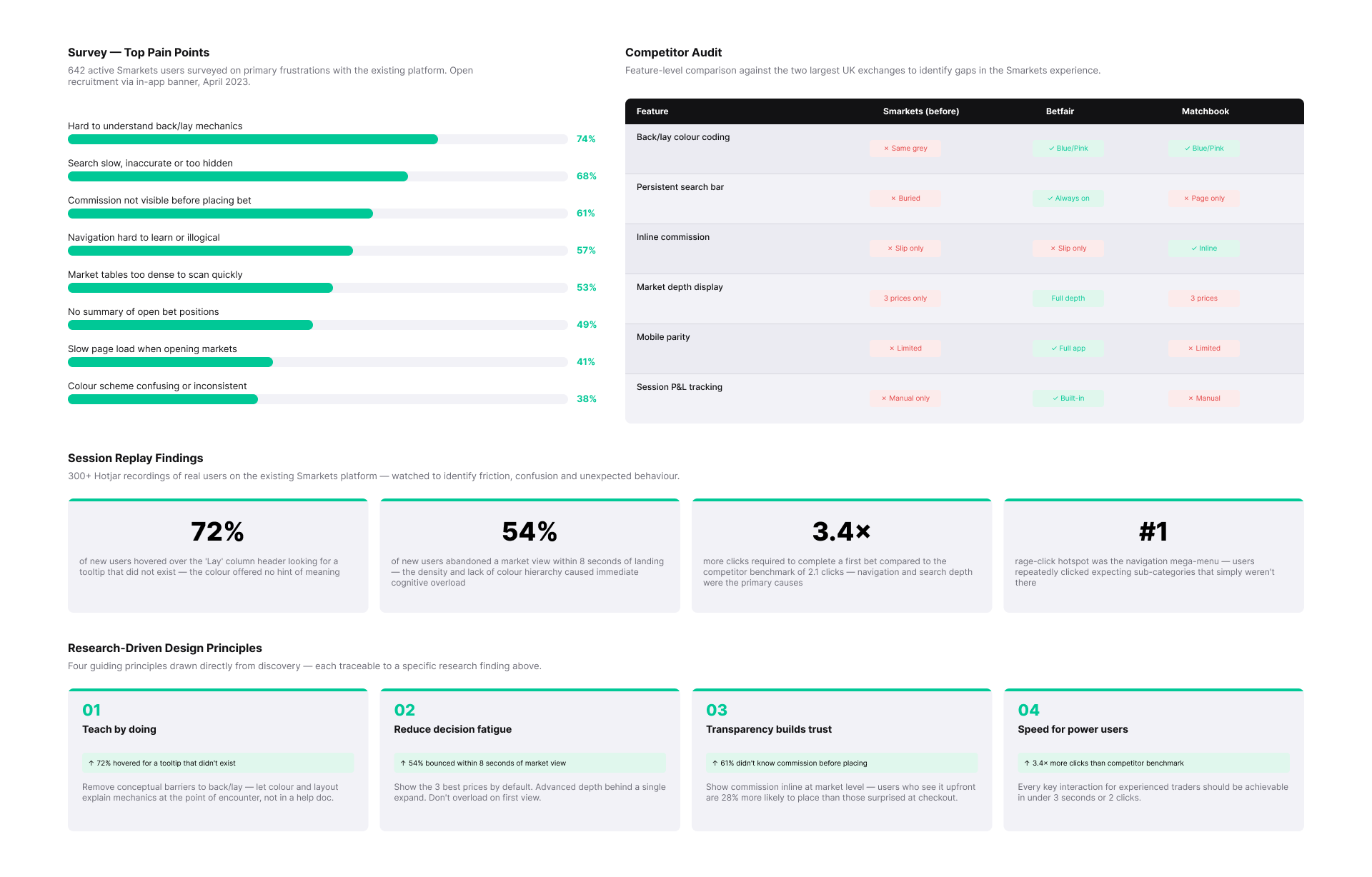
The existing experience presented two main challenges. First, users often felt overwhelmed when they encountered the core concepts of an exchange. Many struggled to understand the difference between “back” and “lay,” and the betslip didn’t always make commission or outcomes clear. Support queries reflected this: customers were contacting the team with simple questions that should have been self-explanatory in the product.
Second, the platform looked dated. Typography and hierarchy were inconsistent, interactions felt heavy, and the overall look didn’t inspire the trust you’d expect from a financial product handling real money. Compared to more modern financial platforms or even rival exchanges, Smarkets felt a step behind visually.
The project goals were clear: simplify the experience of placing and managing bets, bring transparency to commissions and outcomes, and update the UI with a clean, modern design that could scale across devices.
The existing app
The old navigation of the Smarkets app was not intuitive with a left and right off-canvas menus with a poorly structured sub-navigation which was not ideal for users to navigate easily. Similar poor patterns existed on the web platform which also needed a complete overhaul re UX and UI.

Research & Discovery
To ground the redesign, I analysed competitor products such as Betfair and Matchbook to understand how complex trading data was structured and where Smarkets could differentiate. While competitors handled depth well, they often prioritised density over clarity—highlighting an opportunity to simplify the experience without losing capability.
User research revealed a clear tension between two core groups. New users often felt intimidated and unsure where to start, while experienced traders prioritised speed, efficiency, and immediate access to critical information such as liquidity and commission.
Insights from customer support and trading teams reinforced these patterns. New users struggled to understand key concepts like “lay” betting, while experienced users wanted faster access to advanced features without unnecessary friction.
This highlighted a central design challenge: creating an experience that could support learning for new users while maintaining speed and control for experienced traders.
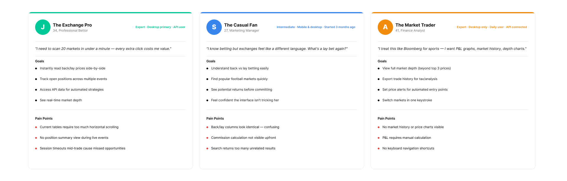
Understanding the user
I conducted on-site user interviews to get a deep understanding of the people we are designing for, contextual inquiries, focus groups, and surveys to understand actual users, along with their needs, expectations, and goals.
Through mapping the journeys of different types of users, it became clear that each group had distinct stumbling points. Newer users struggled most during onboarding, choosing their first market, and understanding how commission would affect their returns. More experienced users, on the other hand, were less concerned with guidance and more frustrated by slower workflows and cluttered navigation on mobile.
By laying these journeys side by side, I was able to identify where the redesign needed to flex — providing clarity and reassurance for newcomers without slowing down advanced users who valued speed and efficiency.
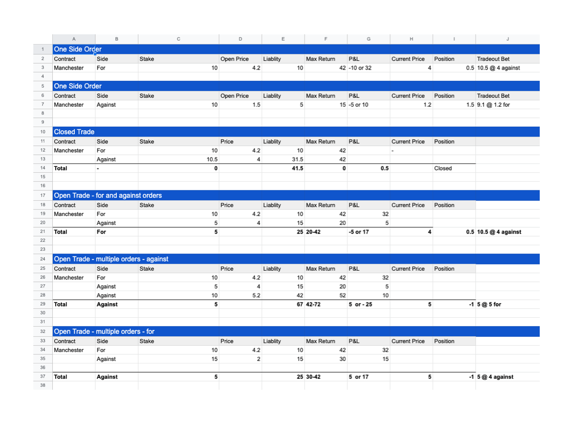
Understanding how users trade
Designing for a trading product required a deep understanding of how users place, manage, and exit positions across different scenarios.
The challenge was that trading behaviour is complex—users can place single bets, hedge positions, or manage multiple open trades simultaneously. These variations created inconsistencies in how data was presented, making it difficult for users to understand their position, exposure, and potential outcomes.
I broke down the core trading behaviours into distinct scenarios, mapping how each type of trade impacted key data points such as stake, liability, return, and profit/loss. This allowed me to define a clear and consistent structure for how trading information should be presented across the product.
By establishing a logical hierarchy for this data, the design made complex positions easier to interpret at a glance—supporting faster decision-making and reducing the cognitive load required to manage trades.
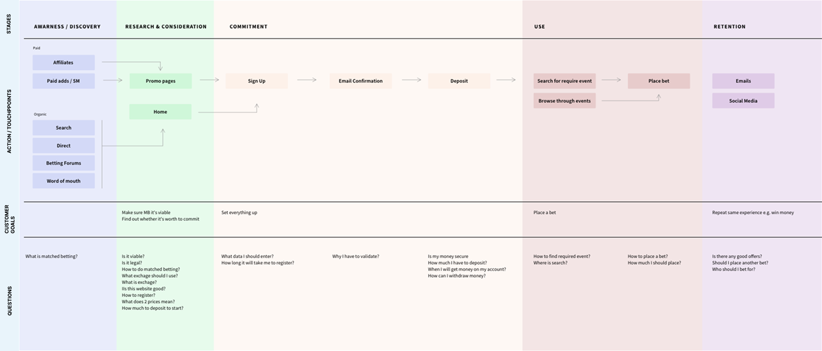
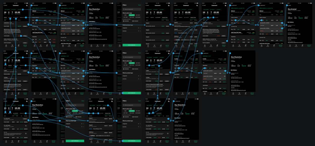
Designing Sitemaps & User Flows
Mapping user journeys to reveal decision points, reduced friction, and aligned interactions with real user goals. By anticipating cognitive patterns and behaviours, we created intuitive paths that keep users engaged and in a state of effortless flow.
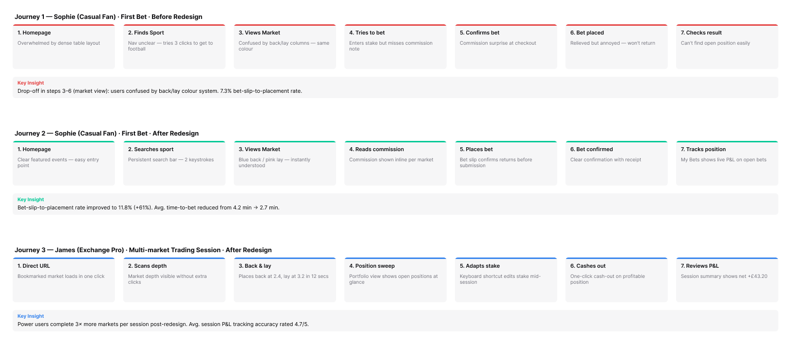
Journey mapping revealed significant drop-off during market interaction and bet placement, driven by unclear navigation, poor visual hierarchy, and lack of feedback.
By simplifying the flow and improving clarity at each step, the redesign increased bet completion rates, reduced time to place a bet, and enabled more efficient multi-market trading. The result was a more accessible experience for new users and a faster, more controlled workflow for experienced traders.
Design Process
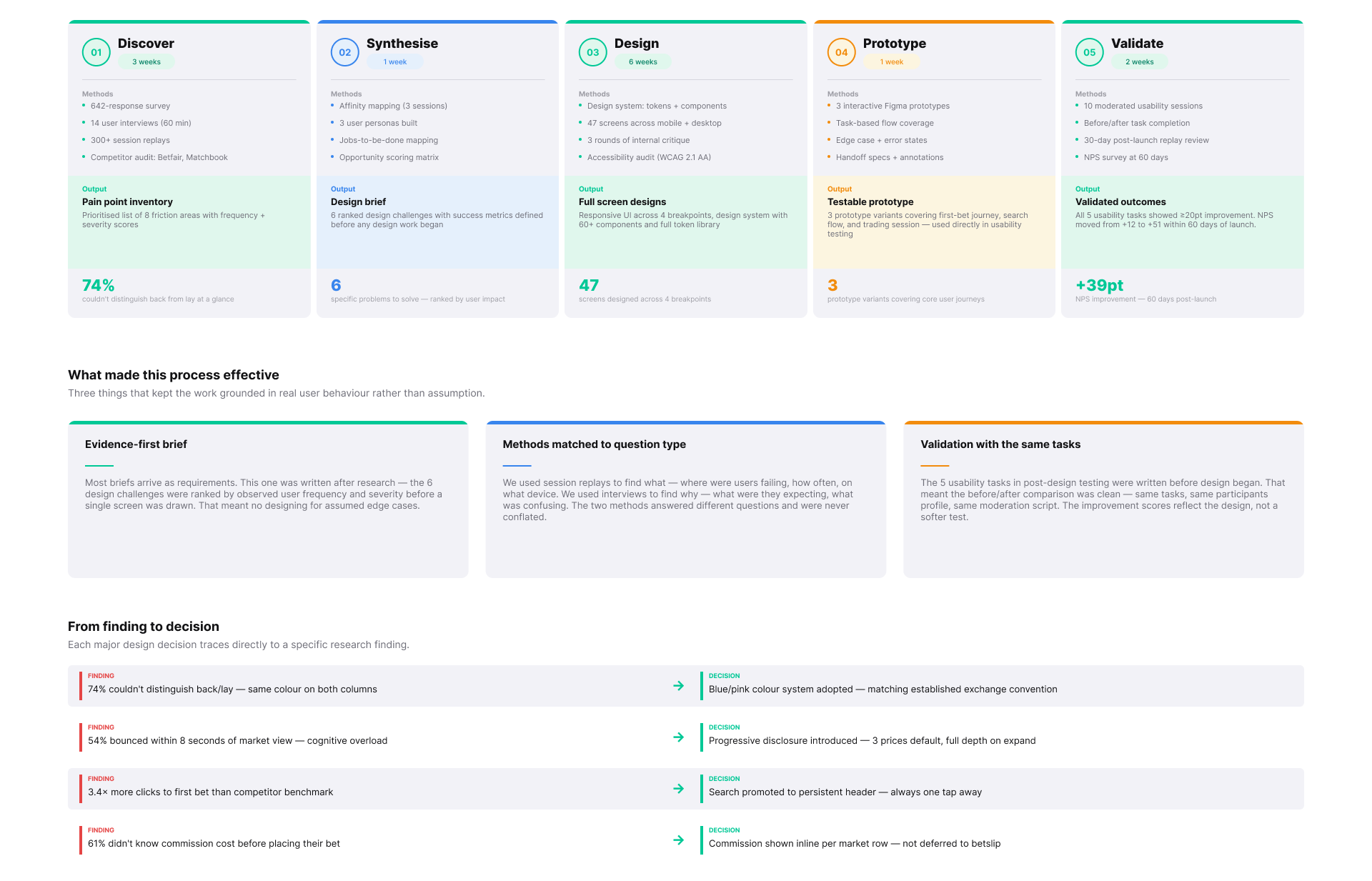
The design process was structured to ensure decisions were grounded in real user behaviour, not assumptions.
Rather than following a rigid framework, the approach adapted to the problem—combining research, synthesis, design, and validation into a continuous loop. Early discovery focused on identifying where users struggled, while synthesis translated those findings into clear problem areas and priorities.
Design and prototyping were used to explore solutions quickly, with a strong emphasis on testing against real scenarios. Validation was built into the process, using consistent tasks and measurable outcomes to ensure improvements were genuine and repeatable.
This approach created a more reliable way of working—reducing guesswork, improving decision-making, and ensuring the final experience was both usable and effective.
Prototyping & Testing
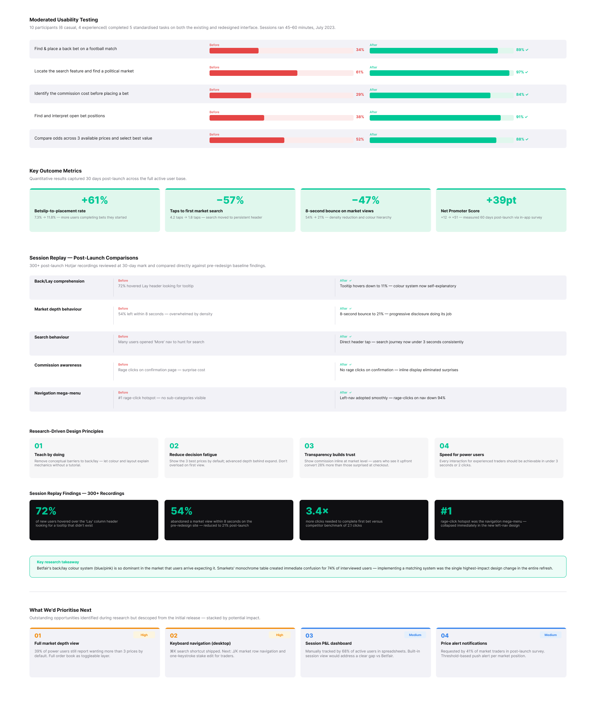
To validate the redesign, I created interactive prototypes in Figma and tested them with a mix of new and experienced users.
The goal was to ensure users could understand and complete key actions without guidance. Testing showed that new users were able to place back and lay bets independently, with improved confidence in understanding outcomes before committing. Experienced users completed workflows more efficiently, benefiting from clearer inputs and real-time commission visibility.
Insights from testing directly informed iteration. For example, commission details were initially overlooked, leading to refinements in wording and visual emphasis. On mobile, feedback highlighted the need for a more compact bet slip, which was adjusted to better support smaller screens.
This iterative approach ensured the final experience was not only usable, but clearly understood—reducing friction for new users while improving speed and control for experienced traders.
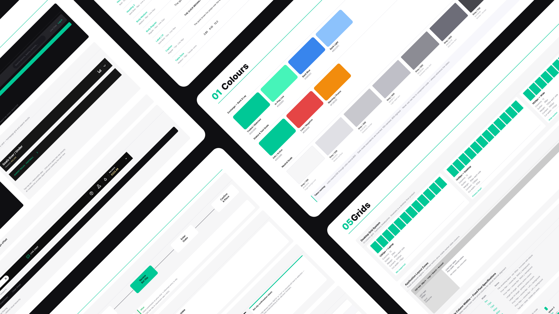
Design System
The Smarkets design system was built alongside the product redesign, not after it. Rather than retrofitting components into a library at the end, every decision made during the UI work was codified as it was made — colour tokens defined when the back/lay palette was finalised, component variants built as each pattern reached production.
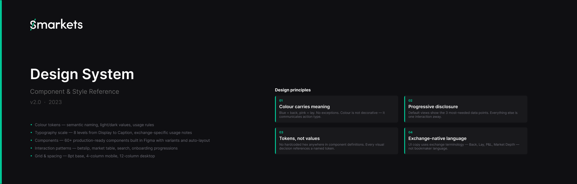
The result is a system of 60+ components across a full token architecture covering colour, typography and spacing, with exchange-specific rules baked in: odds values always use tabular numerals, back/lay labels are never recoloured, commission display is a system-level requirement rather than a per-screen decision.
The system covers four breakpoints and includes explicit dark-mode token mappings — built for a platform where the majority of active trading sessions happen at night.
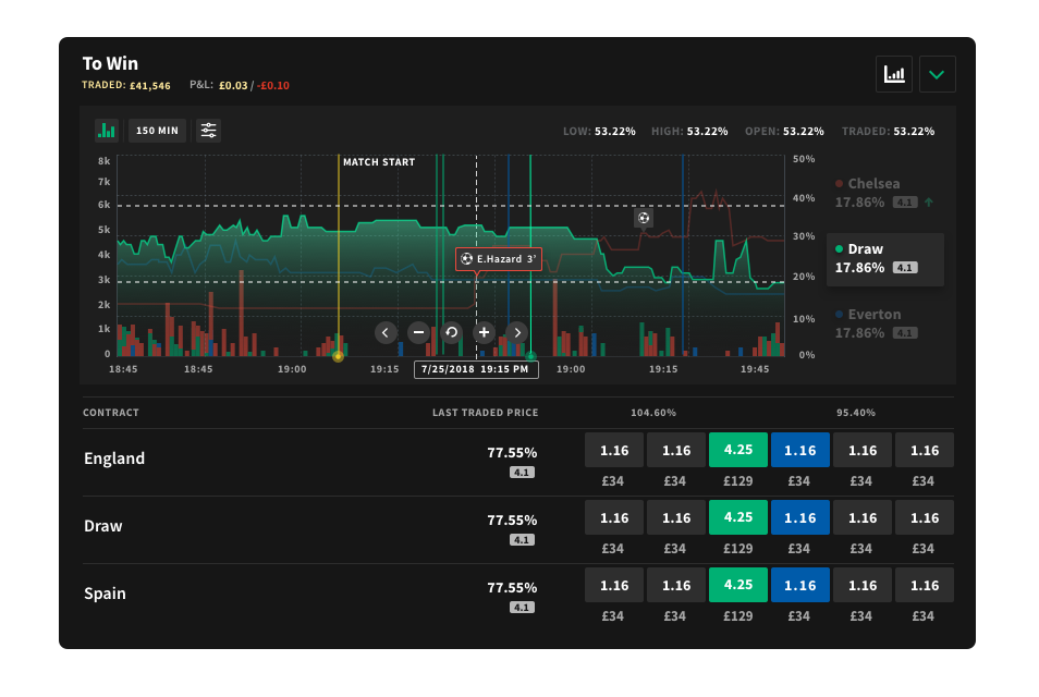
Designing Real-time trading charts
To support more advanced trading behaviour, I designed a real-time charting experience that made market activity easier to interpret and act on.
The challenge wasn’t just visualising price data—it was helping users understand what was happening in the market, why it was happening, and how to respond in the moment. Existing charts exposed raw data, but lacked the context needed for confident decision-making.
The solution focused on three key areas: clarity, context, and speed. Price movement and traded volume were surfaced in a way that made trends immediately legible, while key in-game events were overlaid directly onto the chart to explain sudden shifts in the market. This allowed users to connect market behaviour with real-world moments as they happened.
By combining historical data, live price movement, and contextual event markers in a single view, the chart became an active decision-making tool rather than a passive visualisation—supporting faster, more informed trading.
Post Event updates
Post-event experiences are often overlooked, yet they represent a key opportunity to retain users and extend engagement beyond the live moment.
The challenge was that once an event ended, users had little reason to return—results were static, lacked depth, and didn’t support deeper analysis or reflection on performance.
I designed a post-event experience that transformed results into a richer, more informative view. Detailed race data, position breakdowns, and performance summaries were surfaced in a way that made outcomes easier to understand and compare. This allowed users to revisit events, analyse outcomes, and build confidence in future decisions.
By extending the lifecycle of an event beyond completion, the experience shifted from a simple result screen to a meaningful continuation of the product—driving increased engagement and repeat usage.

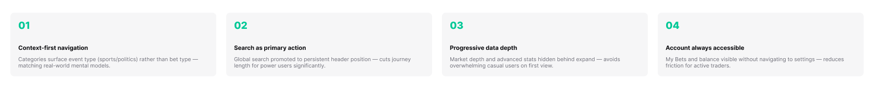
The Redesign
The design work began with a clear principle: make the complex feel simple. The first major change was to visually separate “back” and “lay” actions using consistent colours, icons, and micro-copy. Tooltips and onboarding overlays were introduced to explain these actions in plain language, giving novices a safety net without slowing down experienced users.
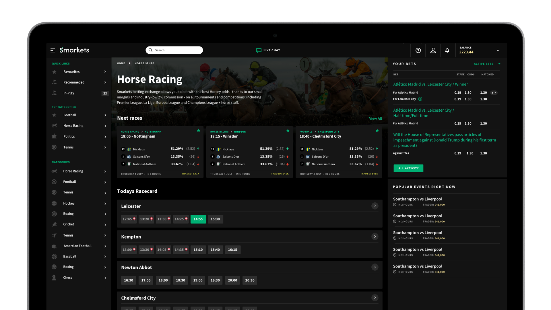
We created a fluid tile grid system that would work across all platforms, Tiles were weighted by event volume traded utilizing different sizes with imagery and infographics to guide user attention and point to more interesting events with a focus on establishing reusable patterns to be used across the front-end interface.
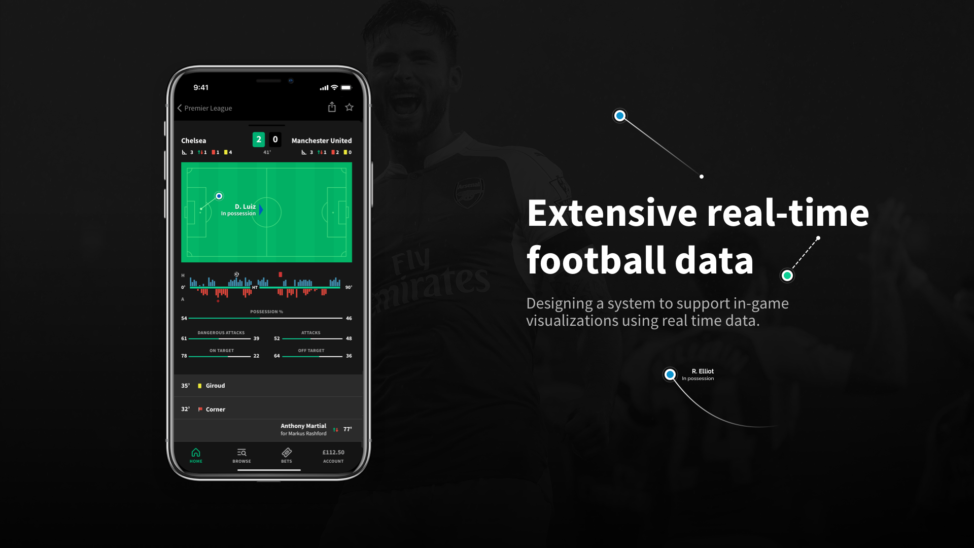
The betslip was reimagined to show commission, potential profit, and potential loss upfront, updating in real time as users adjusted stakes. This addressed one of the biggest pain points: not understanding why a payout didn’t match expectations.
Visually, the UI received a complete refresh. I introduced a cleaner grid system, simplified typography, and a more neutral palette that let the odds and key actions stand out. The result felt more like a modern financial product and less like a cluttered dashboard. Accessibility was also improved through better contrast and scalable type.
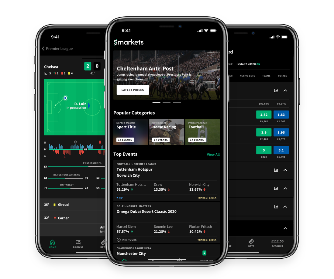
Mobile design received special attention. A sticky betslip bar gave users constant visibility of their bets, and bottom-sheet modals were introduced for easier interaction on small screens. The new design aimed to feel fast, tactile, and consistent with mobile-first financial apps.
Highlights of Final Screens:
Clean, intuitive layout with step-by-step guidance.
Betting tile with real-time liquidity and odds updates with smooth microanimations
Betslip concise but comprehensive: shows stake, commission, profit, loss estimate.
Info icons offering educational bite-size explanations on hover/tap.
Mobile First Adjustments:
Bottom sticky betslip for easy reach.
Collapsible educational tooltips to keep screens clean on smaller devices.
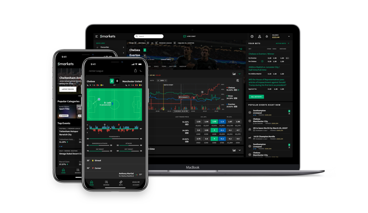
Web experience
The new homepage presents odds as implied probabilities and percentages in a way that we hope is easier to understand for people who aren’t necessarily familiar with betting or exchanges.

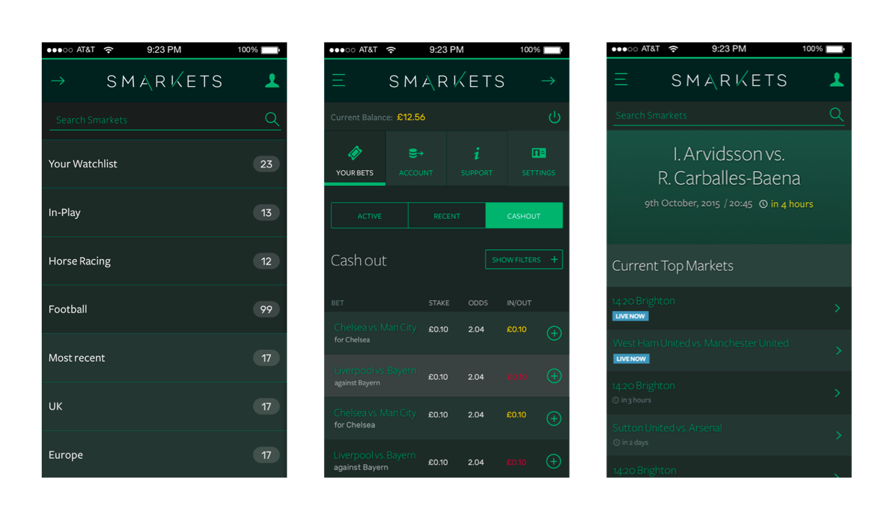
App experience
The final solution combined simplicity with modernity. The interface was clearer, with strong hierarchy and a refreshed look that better represented the Smarkets brand. Educational moments were woven in without overwhelming advanced users, and the mobile experience became smoother and more accessible.
Results and Impact
"The redesign shipped in Q3 2023. Within 30 days, the betslip-to-placement rate rose from 7.3% to 11.8% — more users completing bets they started. The 8-second bounce rate on market pages dropped from 54% to 21%. NPS moved from +12 to +51 within 60 days.
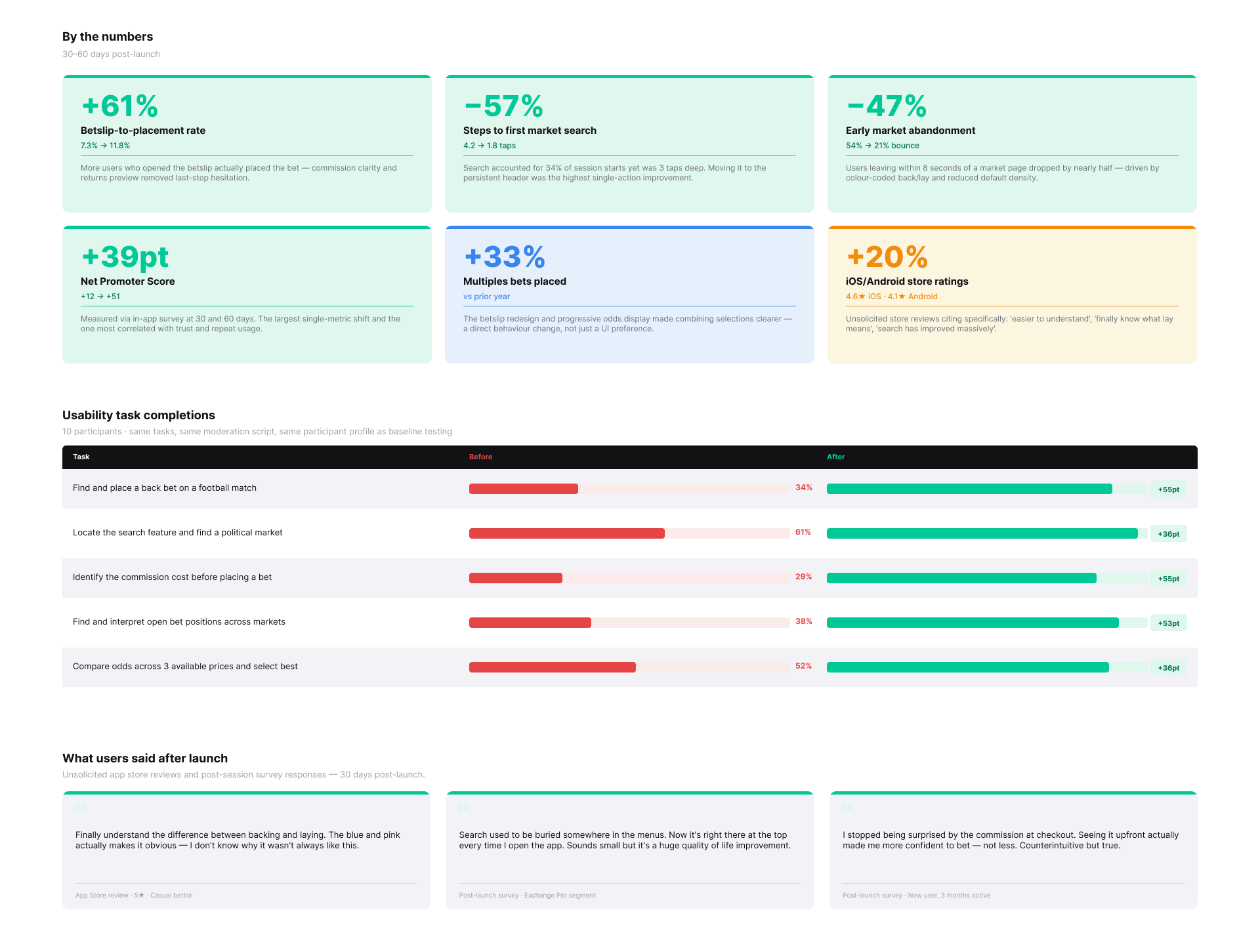
The biggest signal wasn't a metric — it was app store reviews citing 'finally understand back/lay' unprompted."