
What is SBK?
SBK is a modern sports betting app that offers, on average, substantially better odds on the biggest sports events vs. competing bookmakers. SBK also has a unique, community-led social betting network, where users can share their betting tips with others. You can see who is on a hot streak, compete with friends to climb the leaderboard, and share your best bets - like your weekend accumulator - with your followers.

The Task
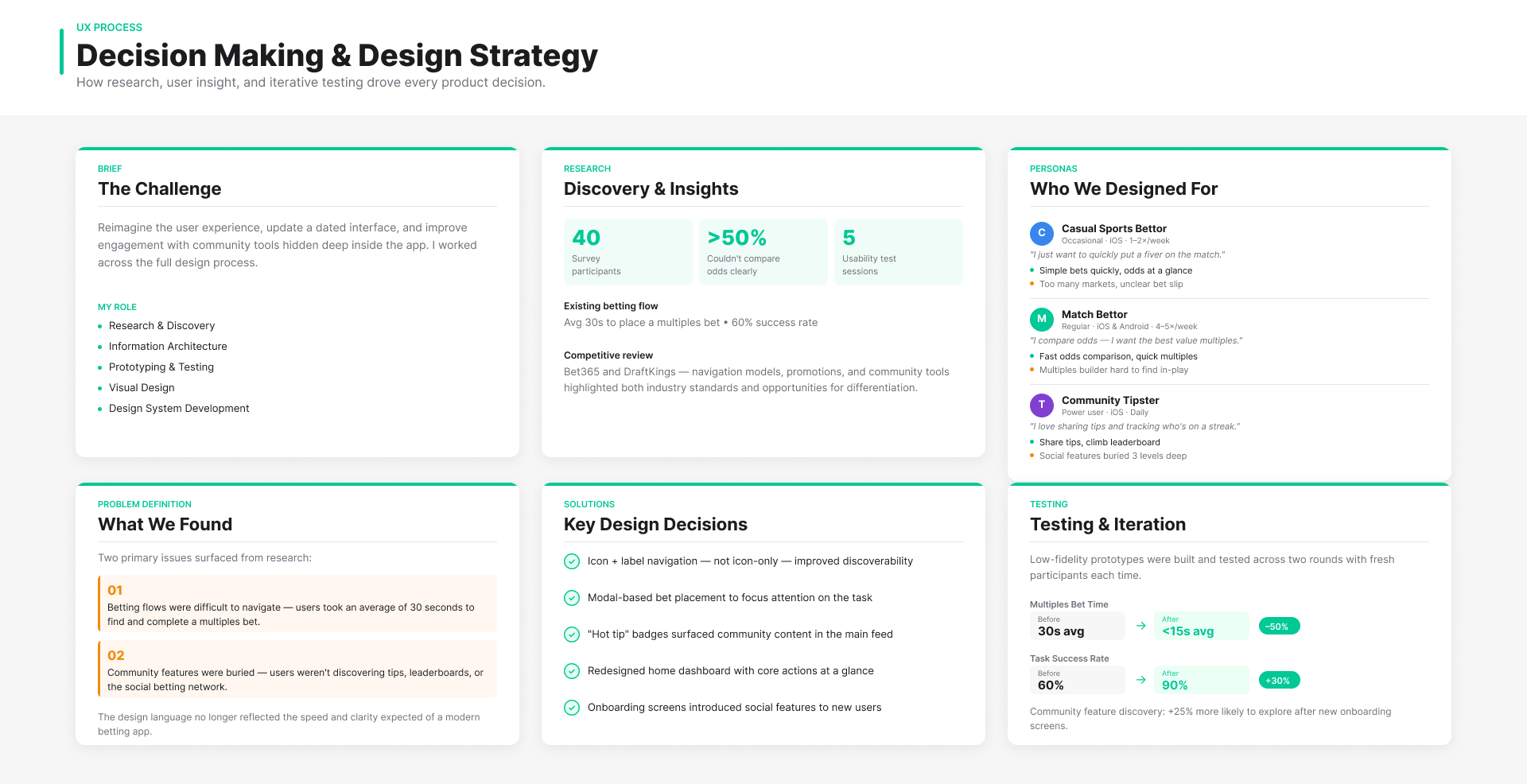
When I joined the project, my role was to reimagine the user experience, update a dated interface, and improve engagement with the community tools that were hidden deep inside the app. I worked across the full design process: research, information architecture, prototyping, testing, visual design, and design system development.
The challenge was clear: users struggled to find key betting flows, social features weren’t being discovered, and the interface felt visually outdated. The goal was to improve usability and discoverability, modernize the UI, and drive measurable improvements in user engagement and satisfaction.
Discovery & Research
The process began with stakeholder interviews to understand business goals and technical constraints, alongside a competitive review of products like Bet365 and DraftKings. This highlighted industry patterns, but also clear gaps in how navigation, promotions, and community features were surfaced.
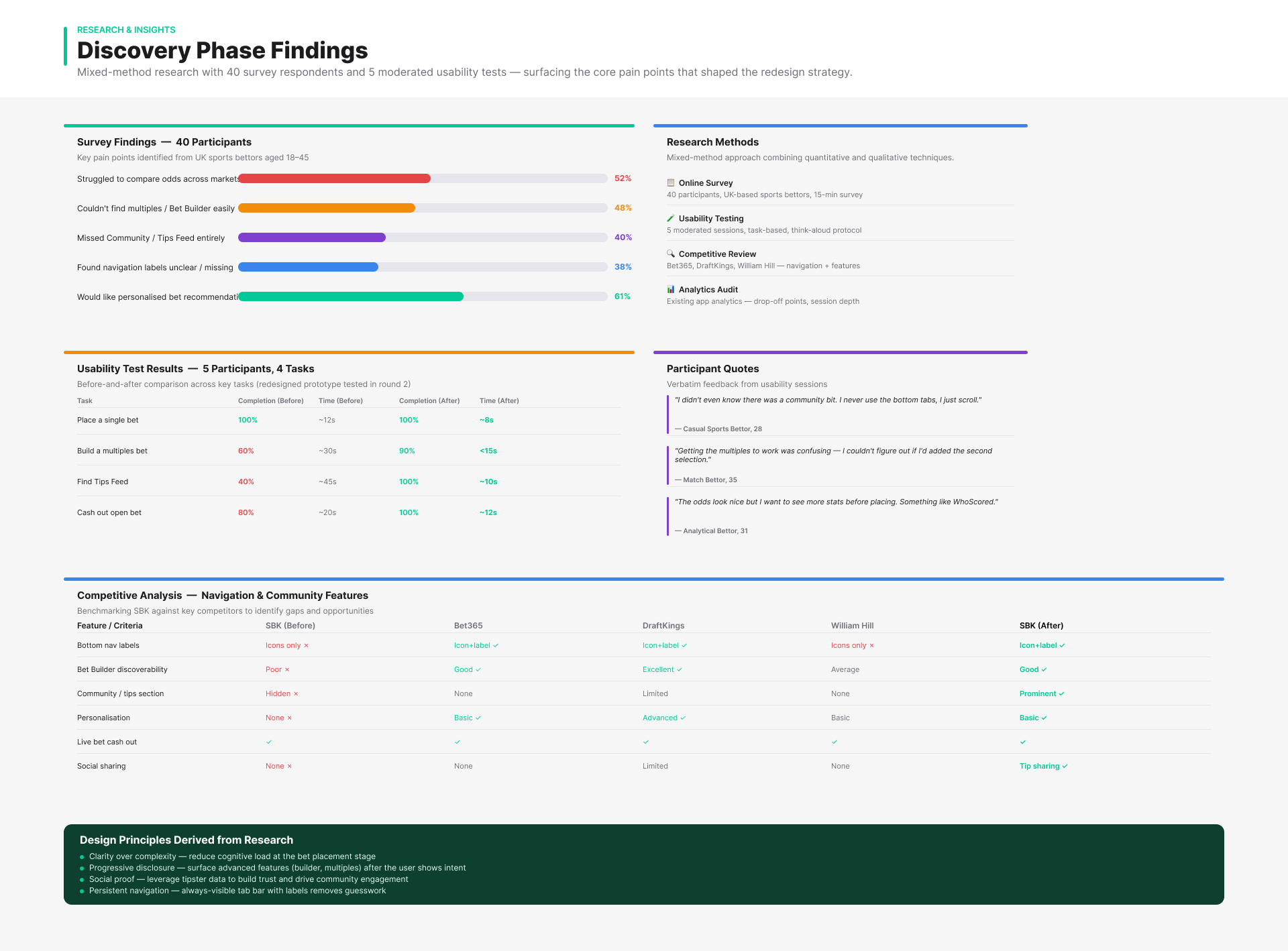
To ground this in user behaviour, I combined surveys, lightweight usability testing, and persona development. In a survey of 40 participants, more than half struggled to compare odds effectively, while many were unaware of the platform’s community features. Usability testing reinforced this — key flows like placing a multiples bet were slow, error-prone, and lacked clarity.
From this, three distinct user archetypes emerged: casual users seeking simplicity, more engaged users comparing multiple markets, and socially-driven tipsters sharing insights. These behaviours exposed fundamental issues in discoverability and flow efficiency, and became the foundation for restructuring navigation, clarifying hierarchy, and improving feature visibility across the product.
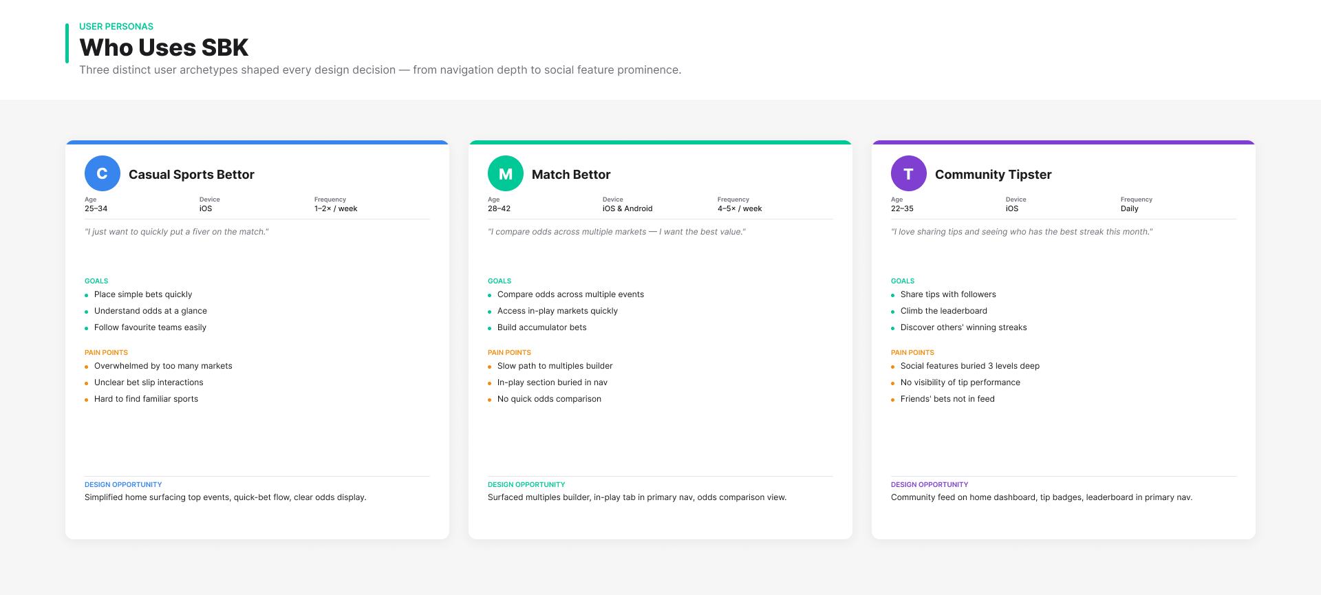
User Journeys
An audit of the existing sitemap revealed a mismatch between the product structure and how users actually navigated key flows. Critical features were buried, and the bottom navigation relied too heavily on icon recognition. I restructured the architecture around primary user intents, improving clarity, reducing cognitive load, and making key areas easier to discover.
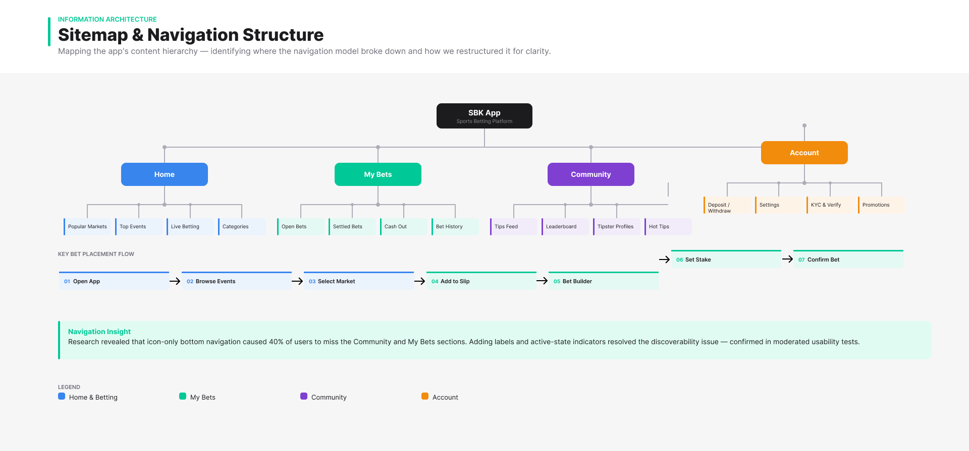
Defining the Problem
The research revealed two primary issues: the betting flows were difficult to navigate, and the community features were buried. In short, users couldn’t easily find the tools they needed, and the design language no longer reflected the speed and clarity expected of a modern betting app.
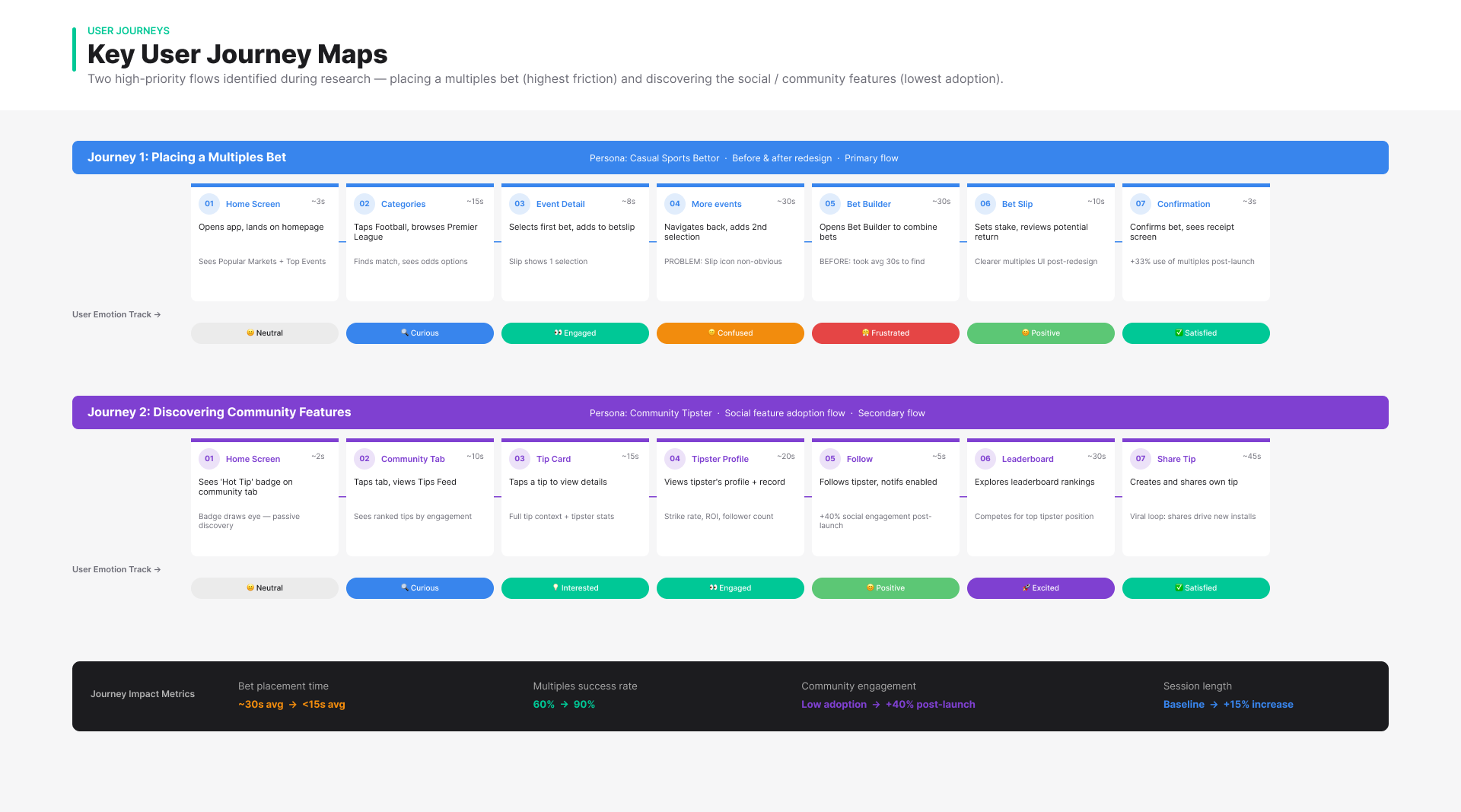
Prototyping & Testing
Low-fidelity prototypes were built in Figma and tested with a fresh round of participants. This time, users placed a multiples bet in less than half the time, and the success rate jumped to ninety percent. When the new onboarding screens were introduced, participants were twenty-five percent more likely to notice and explore the community features.
These tests informed several rounds of refinement. For example, users responded better to icon-plus-label navigation rather than icon-only, and “hot tip” badges increased clicks on community content. Iteration was central: each cycle of testing led to meaningful adjustments.
Research Summary
This phase translated research into clear product direction. By combining behavioural insights with rapid prototyping and testing, I defined a set of focused design decisions that addressed core usability issues while improving discoverability, speed, and engagement across the experience.
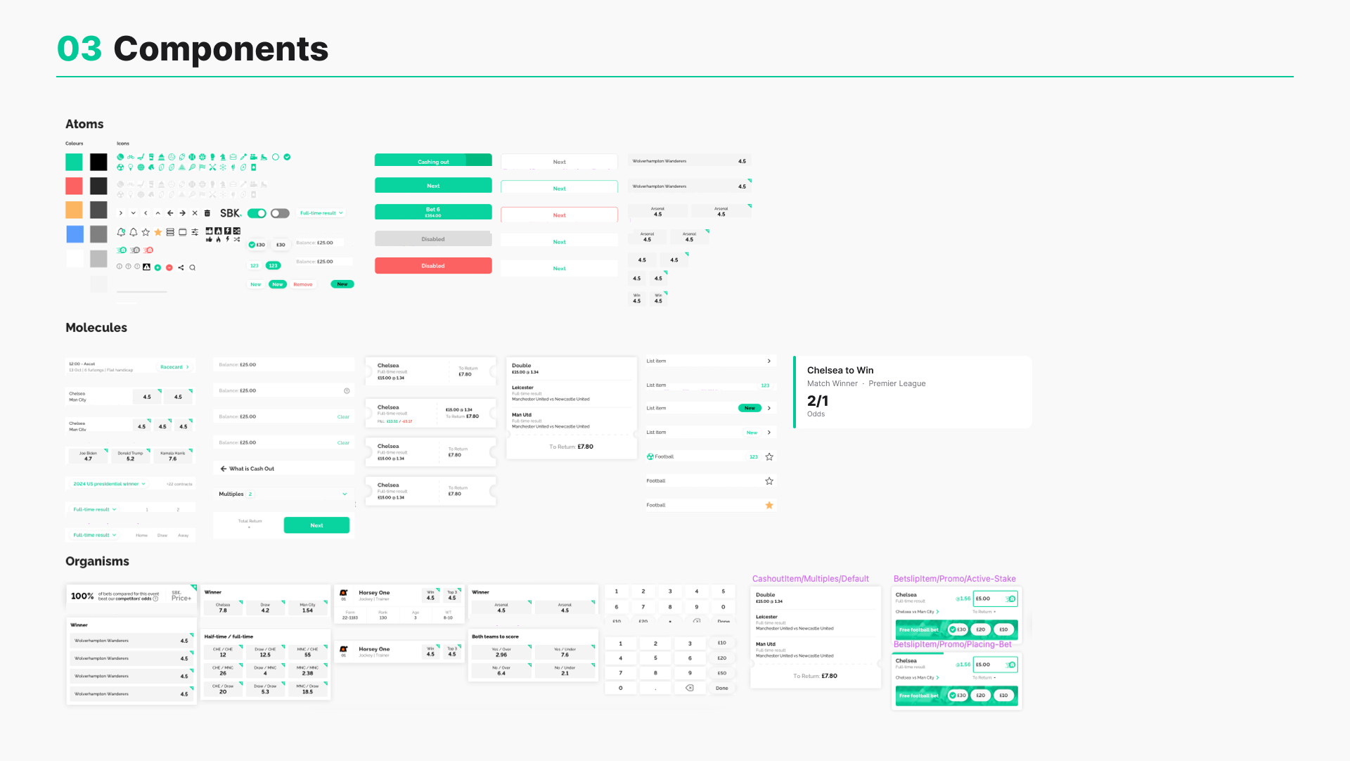
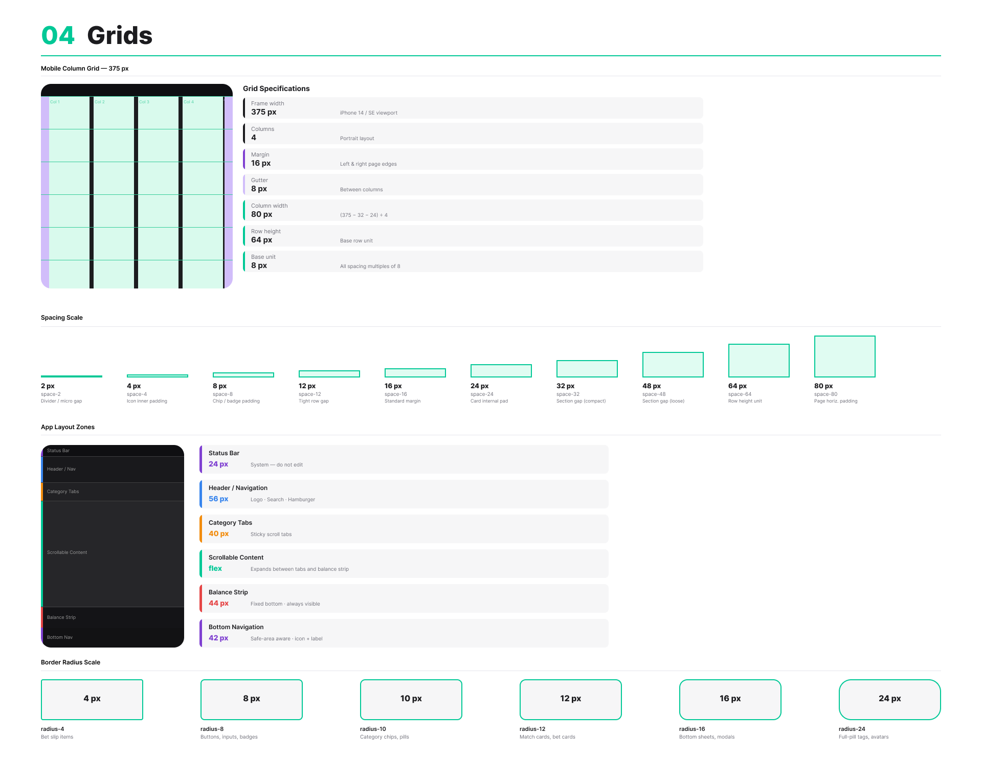
Design System
Alongside the product redesign, I developed a design system to bring consistency, scalability, and efficiency across the experience.
The challenge was that patterns were fragmented and inconsistent, making it difficult to maintain quality and slowing down both design and development. The system introduced a unified set of components and interaction patterns—covering cards, forms, inputs, and modal behaviours—designed specifically around the needs of a real-time betting product.
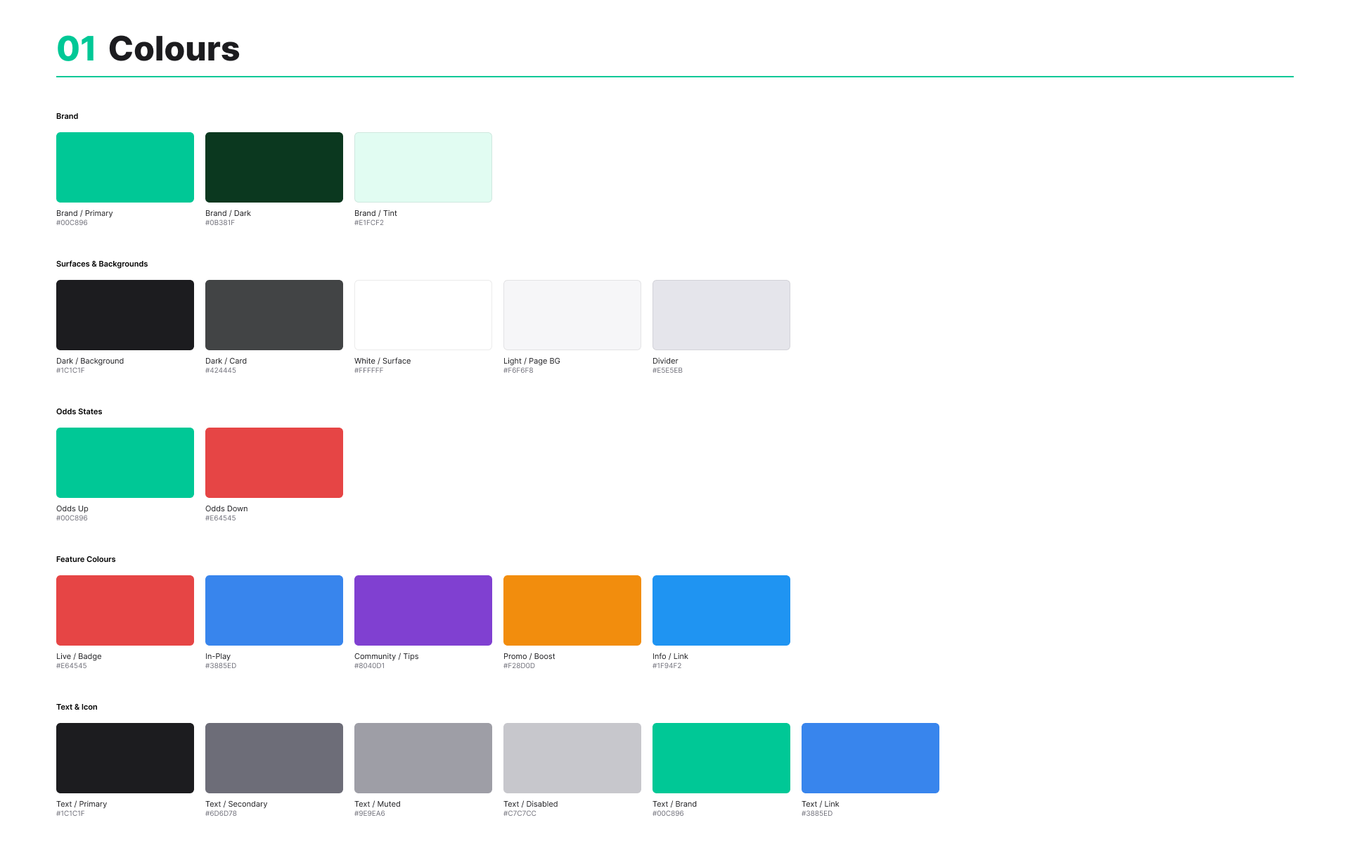
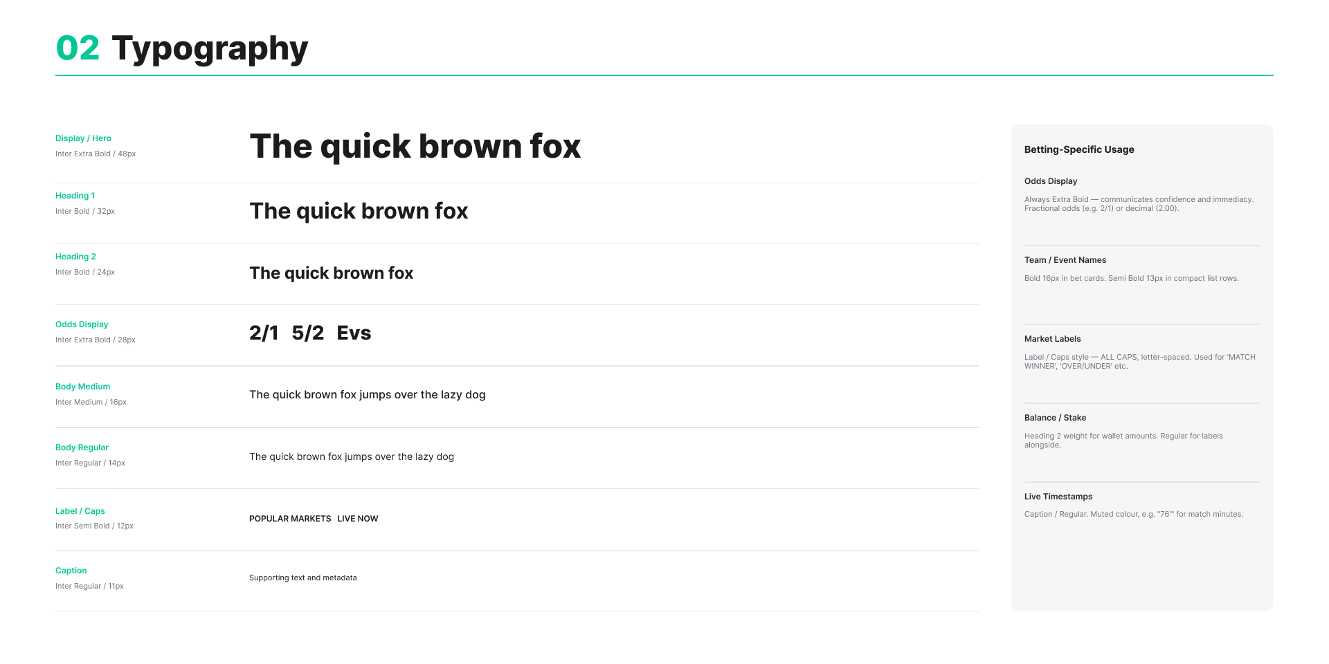
A token-based theming approach enabled the system to scale across different contexts, supporting both light and dark modes while maintaining visual consistency. Accessibility was embedded from the outset, with typography and colour palettes carefully tuned to meet WCAG standards and ensure readability in high-pressure, data-heavy environments.
By establishing a shared foundation between design and engineering, the system improved consistency across the product, reduced duplication, and enabled faster iteration as the platform evolved.

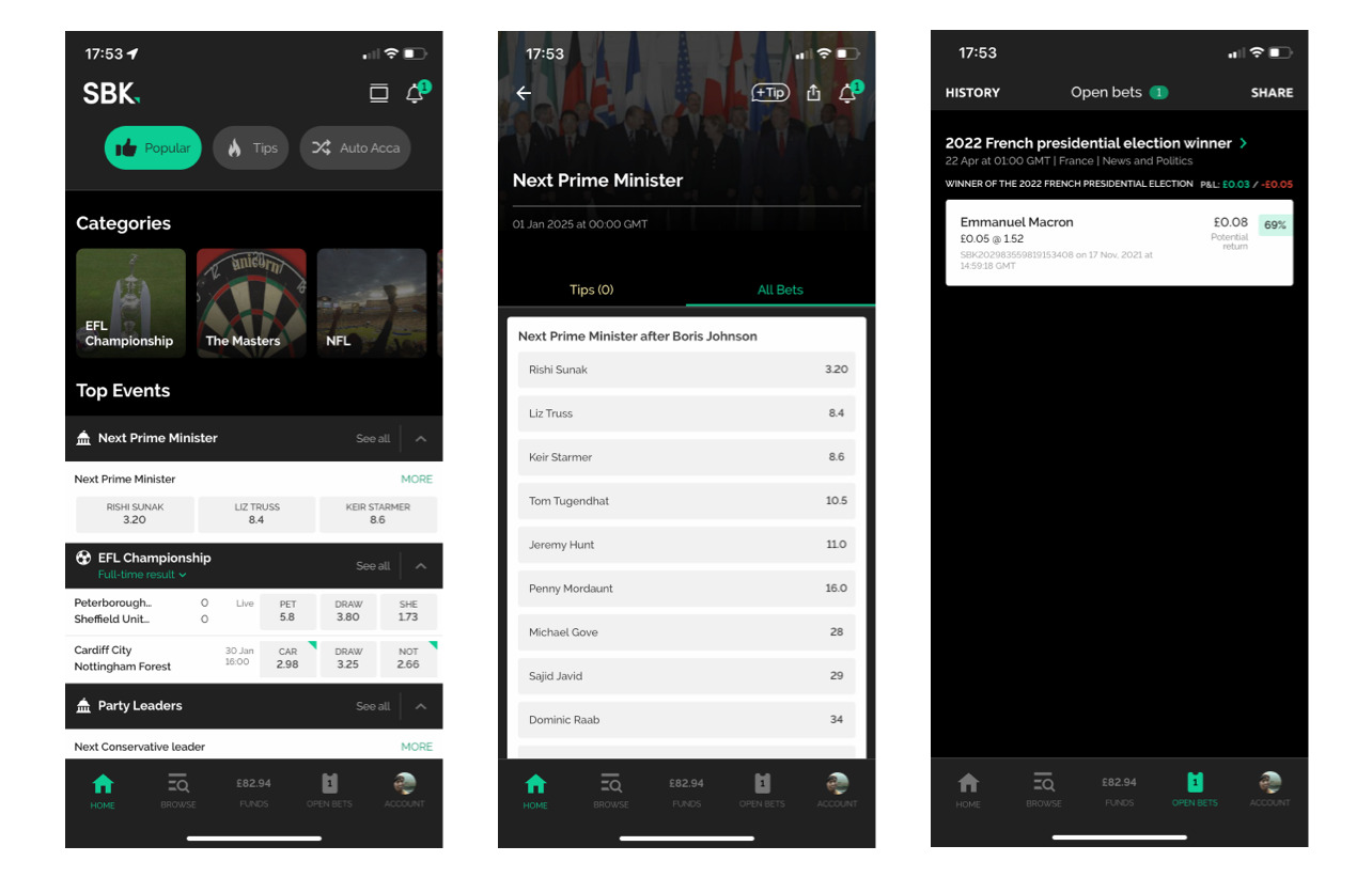
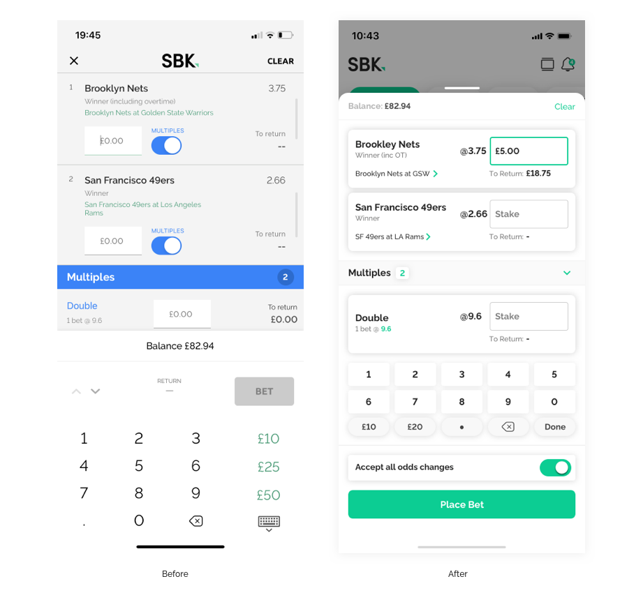
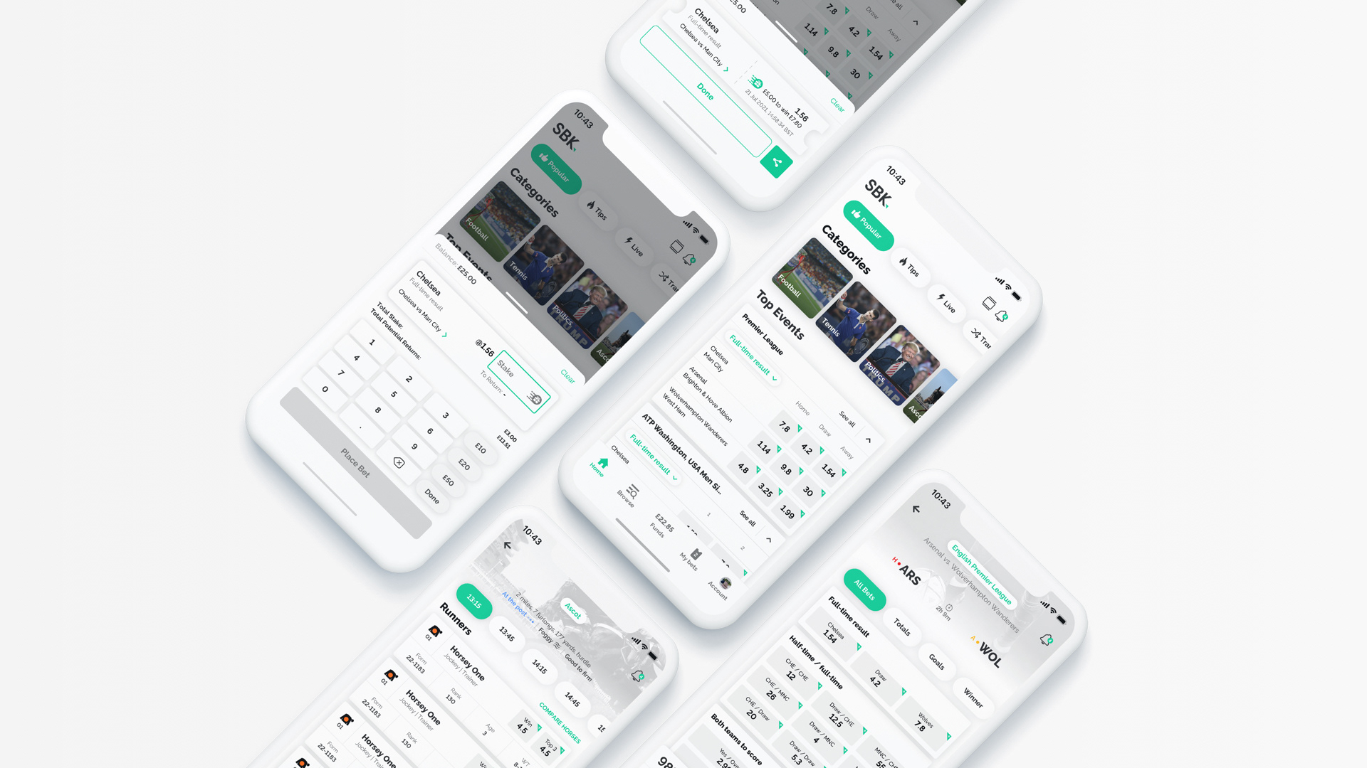
Introducing Modality
Placing a bet is a high-intent action that requires focus, clarity, and confidence. In the original experience, this step was embedded within the broader interface, making it easy to miss key details and increasing the risk of errors.
I introduced a modal-based interaction to create a clear moment of focus at the point of commitment. By isolating the bet slip from the surrounding interface, users could review selections, enter stakes, and understand potential returns without distraction.
The design prioritised clarity and control—key information was surfaced upfront, inputs were simplified, and the flow guided users toward a confident submission. This reduced cognitive load at a critical step and made the act of placing a bet feel more deliberate and reliable.
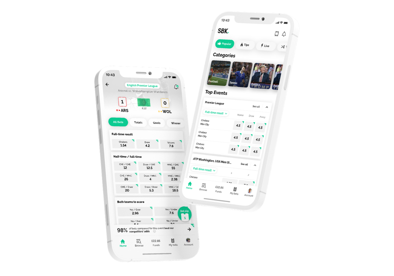
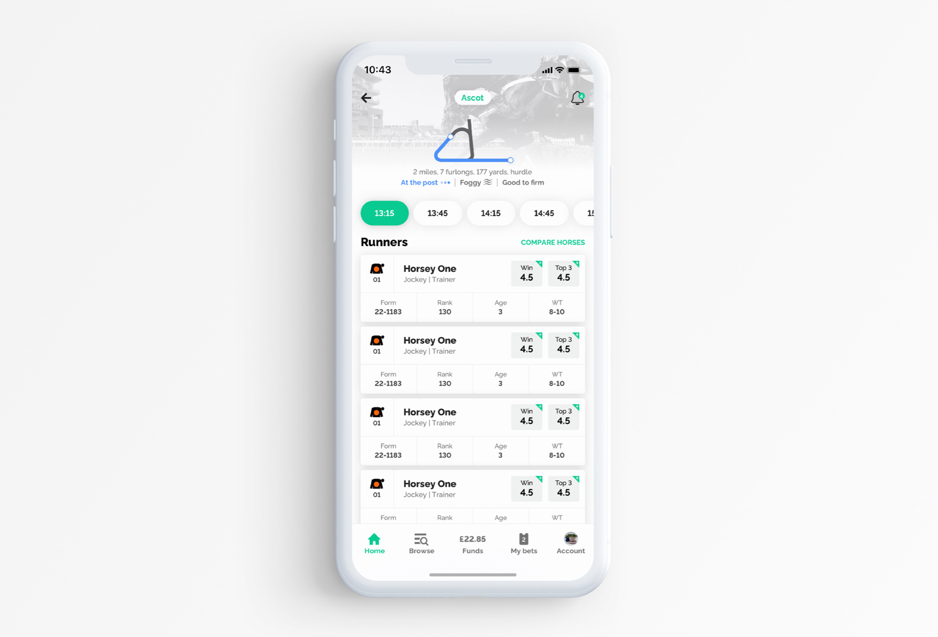
The Redesign
The redesign focused on simplifying the experience and making core actions more accessible at every stage of the journey.
The original interface was dense and difficult to navigate, with key actions competing for attention. The new design introduced a clearer visual hierarchy, surfacing important actions and content at the right moments.
The home dashboard was restructured to prioritise discovery and quick access to markets, while the bet placement flow was streamlined to reduce friction and improve clarity around inputs and outcomes.
Alongside this, social and community elements were enhanced to create a more engaging experience. Leaderboards, avatars, and streak indicators introduced a sense of progression and visibility, encouraging users to return and interact more frequently.
The result was not just a visual refresh, but a more intuitive, engaging, and scalable product experience—making it easier for users to discover, act, and stay involved.
Results & Impact
Within three months of launch, SBK’s Net Promoter Score rose by twenty percent. App store ratings climbed to 4.6 on iOS and 4.1 on Android. Multiples bets increased by over a third, average session times extended by fifteen percent, and engagement with social features grew by forty percent.